


Neocolors, a love story of sorts

If you’ve read some of my previous posts here on Substack, you may know that I imposed on myself a No New Art Supplies restriction this year. Then I broke it by buying a Lamy Safari fountain pen, which I was able to justify as it’s technically a writing instrument which is obviously very different from an art supply. Well, bring on the Brittany Spears GIFS because oops, I did it again. And I can’t so easily justify this one because I bought Neocolors.
The meet cute
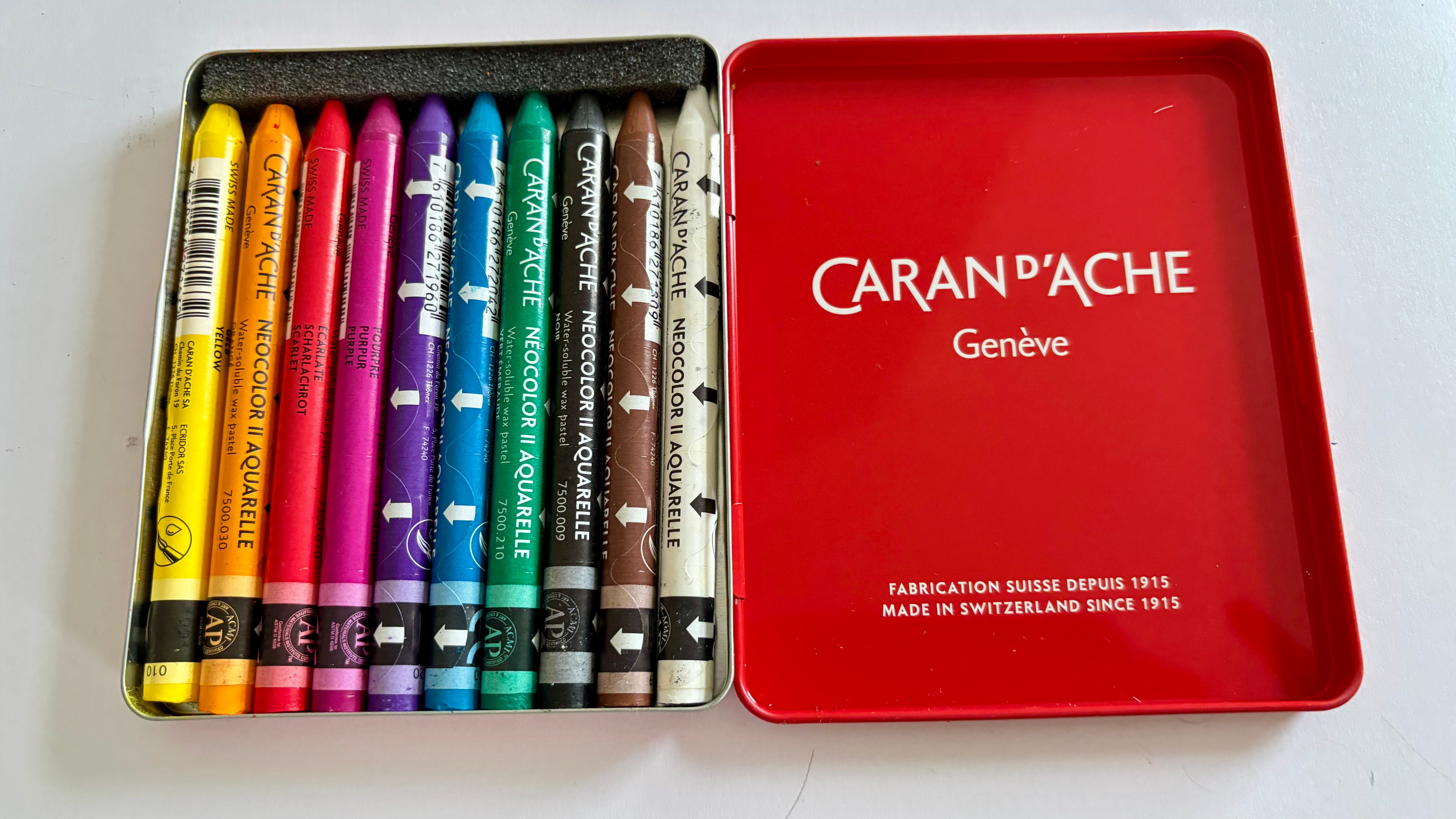
For those that aren’t familiar with Neocolors, they are those wax pastels from Caran d’Ache that look like the crayons of your childhood. They come in two forms, a non-soluble version that no one ever buys or talks about, and the water-soluble Neocolor ii which is everywhere.
I first started playing with the Neocolor ii about 15 years ago when I was getting back into art and experimenting with every material that took my fancy. I settled on watercolours as my medium of choice and so that’s how I used the Neocolors, either laying down colour and activating it with a wet brush or lifting the pigment directly from the crayon or a palette and applying it as a paint. Used dry, the Neocolor is rich and creamy and can be worked over the top of just about any other material. You can also sharpen them to a point for more detailed work. It’s this versatility that makes them so popular.
I’d built up a large collection of Neocolors (the standard full set at the moment has 84 colours, I had almost that many), when I decided to focus on watercolour painting and clear out some of the other art supplies I’d amassed. So they went on eBay. If you want to create watercolour paintings, you’re much better off with some actual watercolour paints or water-soluble pencils, which can be worked in translucent layers and have all those properties that make watercolours so beautiful. While it is possible to use Neocolors heavily watered down in this way, they’re not best-suited to this. They very easily become muddied. So I got rid of them.
But there’s something about Neocolors that keeps calling to me. A few years ago, I was moving away from paints and exploring new techniques as I shifted my style and I bought myself some more. Not to use in the way I would watercolours, but to explore their full potential as a wet or dry medium. Again, I never quite got to grips with them and as I settled on Procreate as my new favourite art tool (which it still is), again they went on eBay.
Second chance romance
Fast forward to May and that little voice in my head started nagging me again. I found myself scrolling Instagram and Pinterest looking at examples of gorgeous sketchbook pages artfully photographed alongside a selection of Neocolor pastels. I probably lost an entire day in which I should have been working on a book dummy, just studying the Neocolor ii colour chart. By coincidence, this year marks 50 years since the launch of the Neocolor and Caran d’Ache marked the occasion with the release of 15 new limited edition colours. So yeah, I bought some Neocolors.
My, somewhat weak, justification was that if a particular material, subject, theme, or technique keeps calling to you over the years, there must be a reason. It would be rude not to take that call.
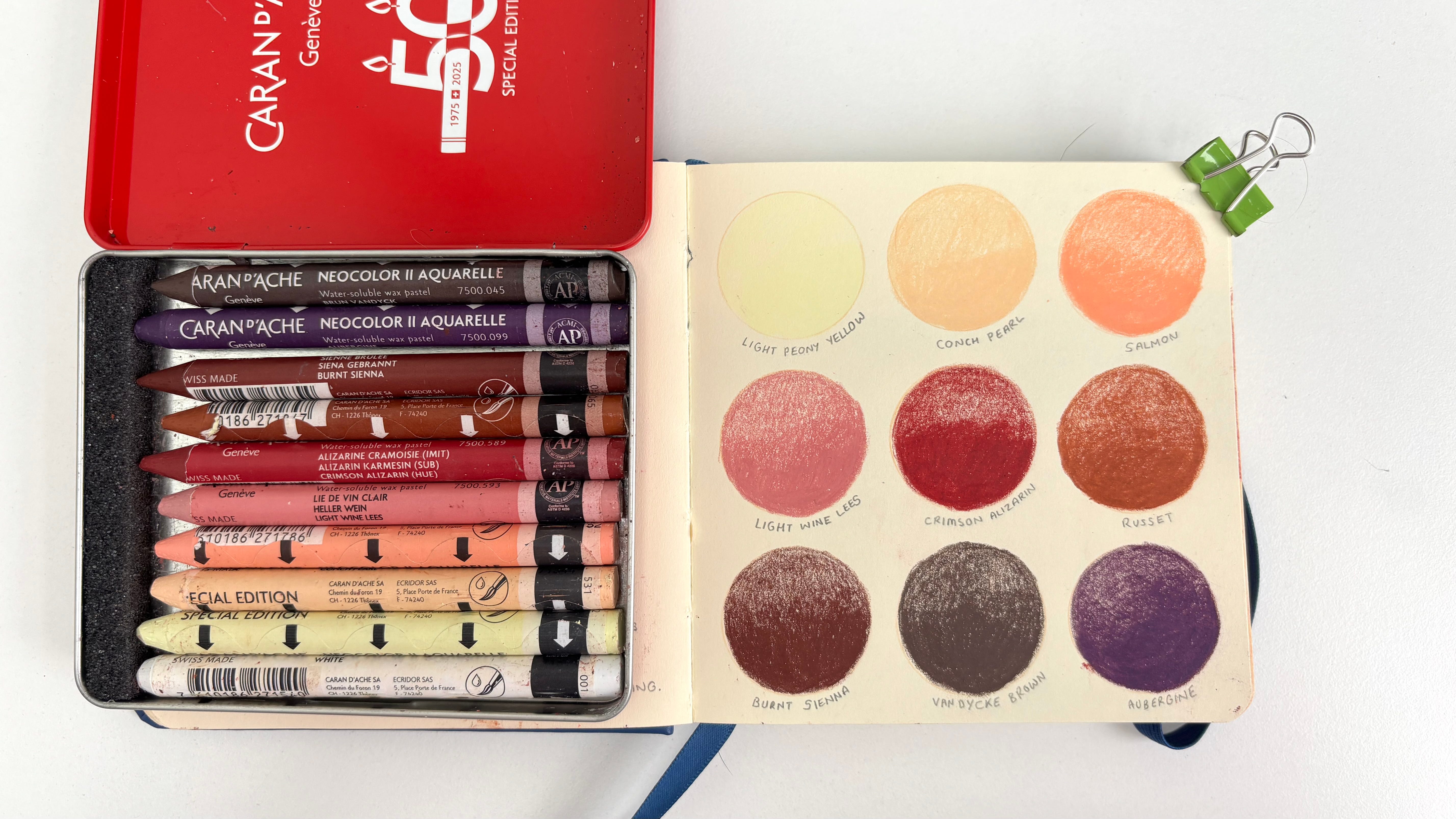
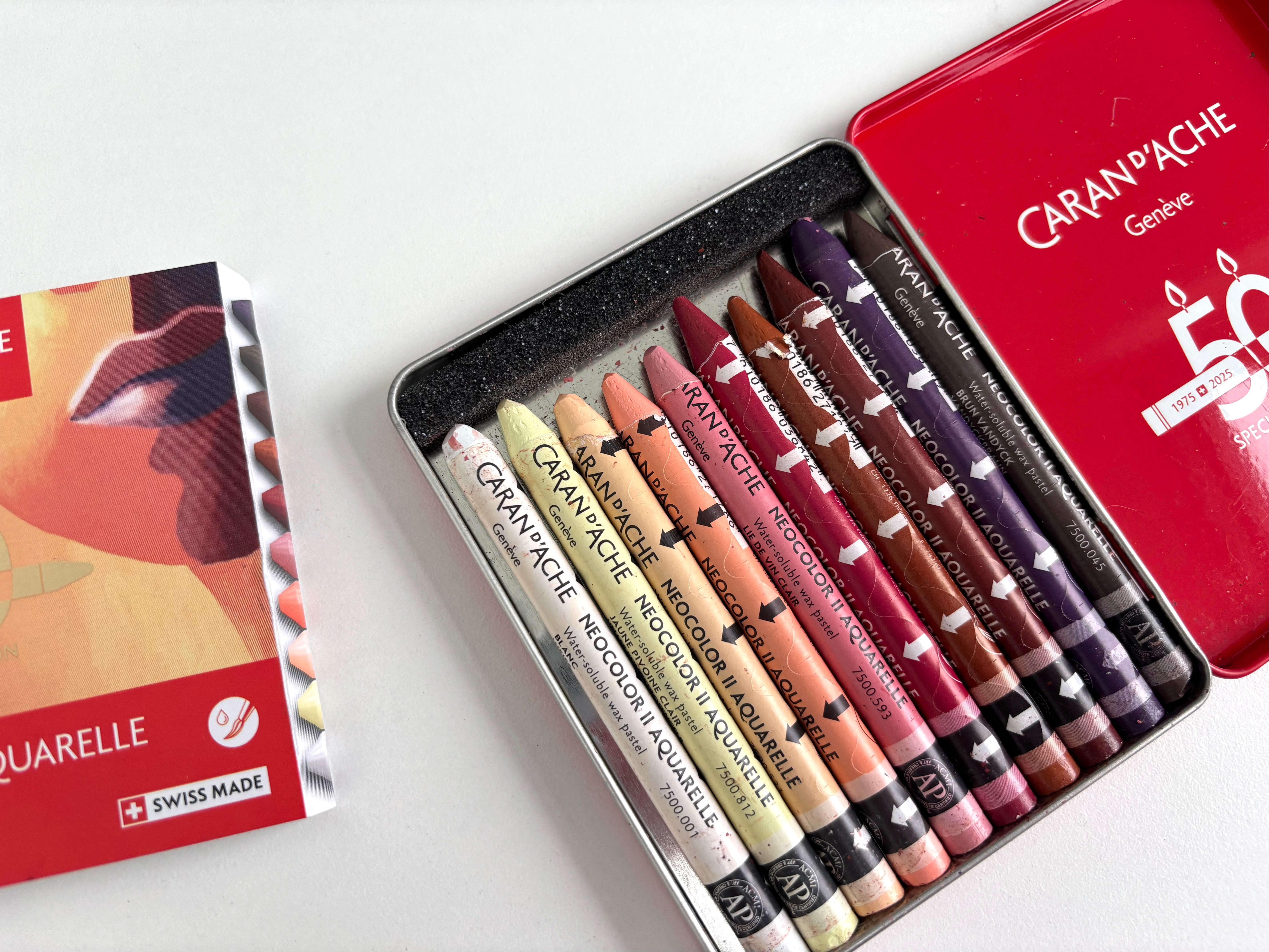
I chose the limited edition Portrait set of ten colours. I’m not a portrait artist so I can’t say whether this collection of colours is a good one for that subject. I simply picked it because I felt these were colours I would use.
Caran d’Ache have upset a lot of their customers in the way they’ve released these new anniversary colours. The 15 new shades are not available to buy as a set in themselves but are split across five smaller sets which each include three new colours and seven from the existing range. So the only way to get your hands on all the new colours is to buy all five sets—or a pricey combined version that comes in a nice wooden box—and likely end up with many duplicates if you already have a collection of Neocolors.
At present, Caran d’Ache say the new colours will only be available in these limited edition sets and will not be added to the regular line up of colours which are available to buy individually. That’s a massive shame because these new colours really plug a hole in the existing range in that they are mostly soft, muted tones. Neocolors are highly pigmented, saturated colours. There are very few paler, earthy shades. (Compare that to Caran d’Ache’s Luminance pencils, the Farrow and Ball-esque colours of which break my heart.) I have a sneaking suspicion however that Caran d’Ache will backtrack on this and add the new colours to the line up at some point, not least because of the backlash they’ve had from angry fans who saw the release as a cynical cash-grab, but from a cynical cash-grab point of view, why would a company invest in developing new colours and then not continue to sell them into the future?
Chemisty
The beauty of the set I bought, and all of the anniversary sets, is that the colours are cohesive. They work together. When you are looking to try out a new art material, you can often save money by buying a set rather than individual colours. Usually smaller sets will contain one of each of the colours on the spectrum plus a black, white and brown and they’re usually the boldest, purest version of that colour. So you’ll get a primary or canary yellow rather than a cool lemon or deep mustard hue or my personal favourite, a buttery Naple’s yellow. This is the case with the basic Neocolor set.
Now look at those colours and think about how you’re going to use them. What exactly are you going to draw? Yes you can play around and get a feel for the material but will you be able to use it in a way that you would want? Can you create the kind of art work you envision using one red, one yellow and so on? Generally speaking, I’d recommend purchasing a small number of individual but analogous colours. For example, choose the darkest blue, and the lightest, one in the middle, one that leans towards green, perhaps a grey that compliments these. This might limit you to working in a more monochromatic way than usual but now as you’re drawing that bird, or flower or landscape, you can add light and shadow and a more subtle variety of tone and texture. Of course all of this depends on your own personal preference and style of drawing. You do you.
This blog post by Daria Danilova beautifully illustrates what I mean. Each of her drawings was created from a limited but wonderfully cohesive palette of 12 Neocolors and they’re beautiful.
Happily Ever After?
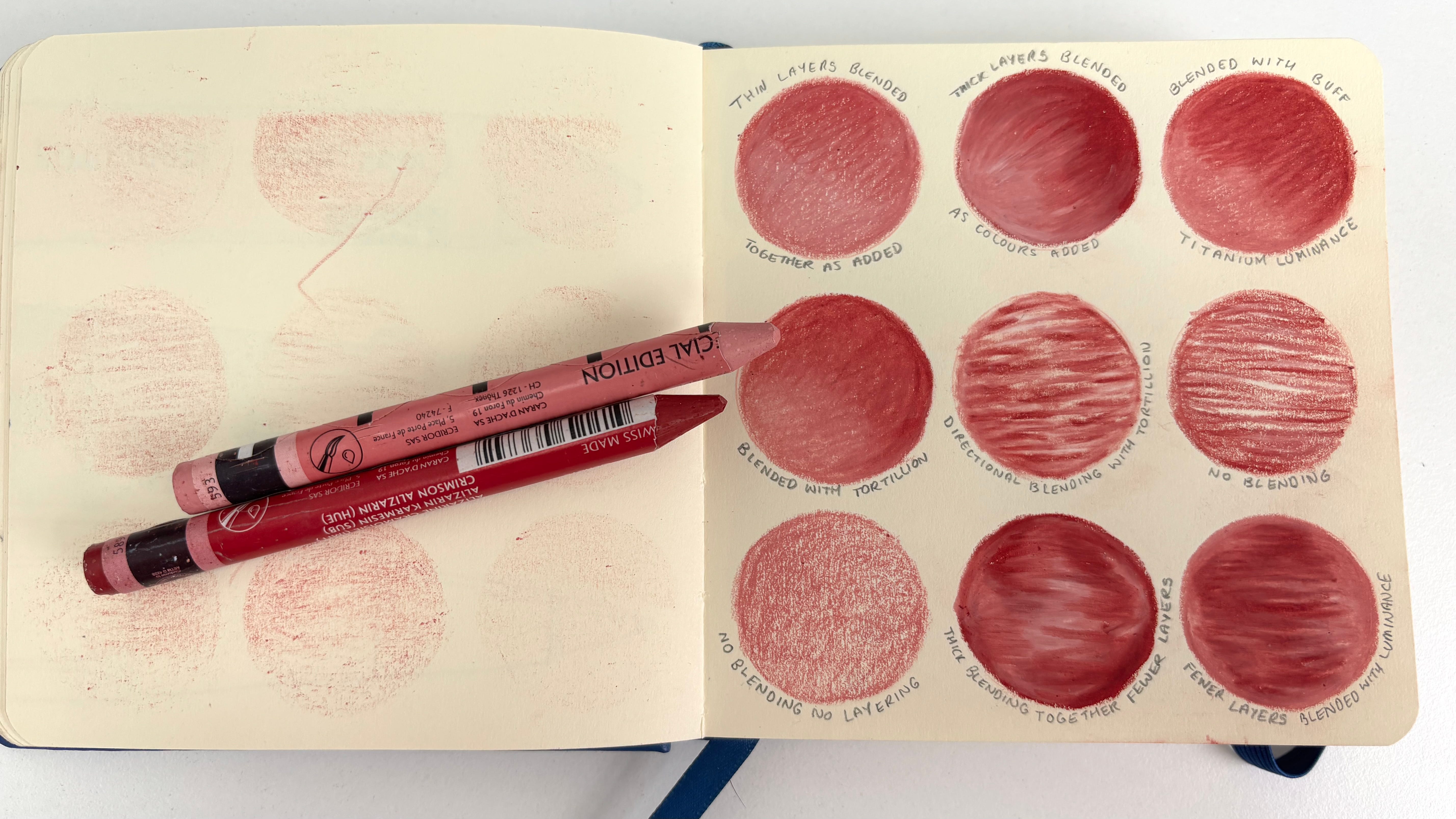
This time round, I have no intention of using water with the Neocolors. (I went with the water-soluble version because they are known to be softer and creamier than the other.) I want to explore this is a dry medium, more like an oil pastel. I’m particularly taken with the work of Clara Debray at the moment. She combines Neocolors with soft pastels to create colourful but dreamy landscapes and portraits. Again, look at the colour choices. She’s not sticking to analogous colours, but she does work in a limited palette that makes her work her own. You can see she lays the Neocolor down thickly, with pressure to create solid colours. She also layers and blends colours together.
Beya Rebai is another artist doing beautiful things with Neocolors. Her use of the pastel differs slightly in that she is usually applying less pressure. She embraces the crayon textures and allows the individual strokes to show. The results are a loose but sophisticated combination of textures.
My own work, right back from when I was a watercolour artist, relies on detailed line and translucent washes of colour. As I switched to Procreate, that line work only became more detailed and important, while the washes were replaced by combinations of paper textures, patterns and solid colours with painterly textures here and there. Neocolors are in many ways the antithesis of all of that. They’re obviously more tactile and creamy than an Apple pencil on glass. They’re also opaque and and the colours, as I’ve mentioned, tend to be bold and saturated. They don’t lend themselves easily to delicate detail or line work. All the things that I strive for in my art work are difficult to achieve with Neocolors. And yet I’m constantly drawn to them.
Recently I’ve found myself wanting to draw the landscapes of my favourite places. I’ve never been a landscape artist, finding the challenge of capturing it all just too overwhelming. I felt I could never begin to do it justice. And in the way I work on Procreate, which always starts with a careful line drawing, I wouldn’t know where to begin. But perhaps with Neocolors in a sketchbook, blocking out rough areas of colour, loose indications of trees here and there, building in details where needed with a crayon that can be readily layered, perhaps I might be able to capture some sense of the view? And perhaps these sketches will eventually inform the way I approach my digital drawings. Perhaps.
Or perhaps, there’ll be a set of limited edition Neocolor ii wax pastels going on eBay in six months.
This cracked me up because it’s spot on: “They come in two forms, a non-soluble version that no one ever buys…” 😂 Lovely post, I learned a lot that I didn’t know about neo colors!
I didn’t even know there was a non soluble version lol. I had the basic set for awhile but like you said I struggled to find a way to use them because of the colors. Then I realized i could use the white on top of gouache as highlight, and that opened the door. They’re so great on top of gouache because they’re basically just a stick of gouache! More opaque and saturated than colored pencils. I haven’t found a way to use them on their own yet tho.